The Dreaded Fundraising Plateau: How Head-to-Head Tests Can Spur Program Growth
The art of fundraising: It’s a unique alchemy that takes engagement-driving best practices and infuses them with the strategies proven to work for your particular audience – all the while remaining true to your organization’s voice and mission.
We’ve seen growing nonprofits hit a fundraising plateau when all the pressure is placed on in-house copywriting and brand teams to power ongoing growth while faced with messaging constraints. What’s at risk with a plateau like this? You’re leaving essential revenue for your mission on the table.
It’s at this critical point where a fresh creative take – while still adhering to stringent brand guidelines and mission messaging – is needed to continue to grow fundraising. With access to testing and optimization insights across more than 40 mission-based organizations, we’re uniquely positioned to help our partners solve for exactly this.
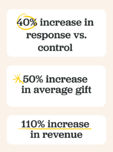
When one of our partners reached a plateau just like this, we quantified their opportunities for growth through a head-to-head test, set up for one of their program’s biggest giving day campaigns. Read on to learn how our fundraising approaches proved the benefit of refreshed creative strategy, while working alongside their team and adhering closely to brand guidelines, to achieve more than double the revenue, a 40% increase in response rate, and a 50% increase in average gift.
The Challenge
In our work with this organization leading up to the head-to-head test, we’d seen their talented in-house writing team take them far – but without the benefit of insights into broad testing and optimization results across the entire fundraising industry, it grew clear that they were unable to realize their full potential, leaving money on the table that could expand the impact of their work and mission.
Working closely with their in-house team, we set out to develop a test to illustrate how optimizing every element of their messaging toward driving response, while still adhering to their organization’s voice and brand guidelines, could help maximize the effectiveness of their fundraising – especially on significant giving days like the campaign we’d build the test around.
(Psst! … If these challenges feel familiar to experiences you’re having at your organization, reach out! We’re always happy to discuss how we can try out a similar head-to-head test to help your team identify opportunities for growth.)
The Solution
To maximize the effectiveness of our nonprofit partnerships, our strategists approach collaboration with the question: If I were working here, who from among this organizational team would be critical to get on board with the tactics that will drive success? We brought this approach to life with this organization by spending time with their graphics and creative team, to understand their challenges and any barriers they might encounter – then working with them to navigate those challenges and present solutions.
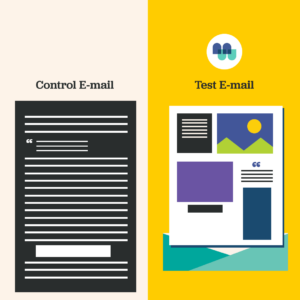
This test was laser-focused on email content strategy, so our test and control emails both linked to the same donation form. As always, adherence to brand guidelines was essential, so all materials went through the in-house brand team for approval. Central to this head-to-head test was our intention to work alongside, not against, our partner’s traditional creative team.
While every organization’s optimal strategy will be unique, this head-to-head test leveraged an assortment of engagement tactics to drive response, including:
- Prominent asks at the top of the email
- Match math buttons
- Impact sharing
- … and more!
And, because a data-powered approach is at the center of our partnerships, we delved into their results from previous campaigns to build out a customized approach to messaging and segmentation that would most effectively move the needle on response rates and revenue for their unique audience.
The Results
Whenever we run a head-to-head creative test, we rigorously monitor the results to see if they reach statistical significance – and with this test, we achieved it quickly. For this giving day email campaign, our test emails outperformed traditional messaging approaches to drive:
For organizations who might be feeling stuck within their fundraising programs, with FY25 just around the corner, the outcome of a head-to-head test like this can crucially inform your plans for next year. If you’re interested in trying out new tactics and results-driven approaches, get in touch with us. We’d love to talk about how a creative test can drive results for your program.
For more examples of MissionWired’s head-to-head creative test results, check out Three Key Strategies to Grow Email Revenue. For insights into the top-performing Giving Tuesday and year-end fundraising tactics, read Top-Performing Giving Tuesday Tactics: Strategies That Work.