Creative and brand strategy
The Art of the
Political Logo
Khyneesha Edwards, Senior Graphic Designer, MissionWired
Khyneesha Edwards serves as senior graphic designer at MissionWired. Since joining the team in 2020, Khyneesha has helped programs develop and elevate their unique visual identities, building content strategies that have driven unheralded year-over-year growth.
MissionWired is at the forefront of creative political campaigning, building innovative engagement strategies that keep our political partners ahead of the curve from campaign launch through Election Day – and setting new trends in fundraising tactics along the way. We’re always on the lookout for the design strategies that connect audiences to a candidate or cause. We’ve seen it all, including a significant design shift brought on by the 2020 election cycle.
In cycles past, our colleagues have explored innovative political logos and how they’ve broken the mold – for better or for worse – and what they say about the rules of political design. Now, we’re excited to expand our analysis to highlight five designs from the post-2020 cycles and how they point to a bold new moment in political logo design.
Read on as I, together with my colleagues on MissionWired’s graphic design team, dig into the most compelling themes in past and present political logos.
![]()
Where We’ve Been: The Political Logo Before the 2020 Cycle
The key to any successful political logo is not only a finished product that represents the candidate or cause it stands for but one that also welcomes and represents the constituencies that the candidate or cause seeks to serve. The audience for these designs needs to feel a familiarity and relatability in what they see, as well as an energy of inspiration and optimism. In the three pre-2020 cycle political logos below, we can learn a little bit about the design choices that resonated with voters – and those that missed the mark.
The Obama “O”
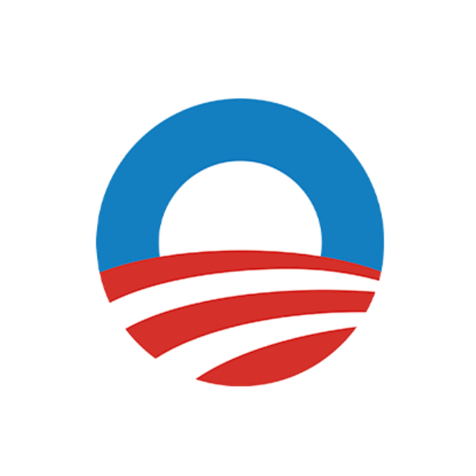
The best place to begin with political design in the digital era is with Obama’s iconic “O” logo. Historically, candidate names have been scrawled out in big, bold, uncomplicated font to be easily read on yard signs. The Obama team kept the big, bold letters but – reflective of a campaign building a groundbreaking digital presence in fundraising and social media – also designed a mark for the profile-picture age.
Created by Sender LLC for Obama’s 2008 run, the design wisely took the first letter of Obama’s last name and turned it into a sunrise, a symbol of hope for a country in the throes of two wars and a historic financial crisis. This wasn’t a typeset yard sign; this was a true and proper logo. You didn’t need to read his full name to know who this “O” was referencing.
It was so successful that it withstood the shift away from 3D to flat design between Obama’s 2008 and 2012 campaigns and even serves as the logo for The Obama Foundation, nearly 15 years after its debut. Between the symbol and the Gotham font craze it ushered in, the Obama campaign fundamentally changed design for Democratic campaigners moving forward.
The Jeb “!”
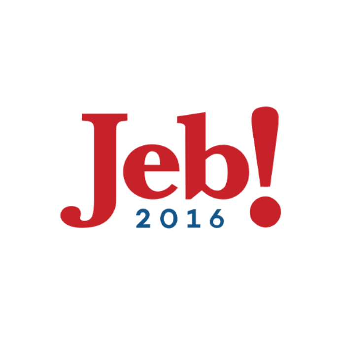 Ah, Jeb Bush’s logo, with its oft-derided punctuation. Much as we don’t believe that one gaffe can single-handedly sink a campaign, we don’t believe a design choice can either. However, these moments can become shorthand for everything people dislike about a candidate, and that can be disastrous.
This is appropriately dubbed the “Please Clap” of political logos: an attempt to skip ahead to first place and feign broad enthusiasm for a campaign that never really got off the ground. The feeling that the Bush campaign was asking you to yell a monosyllabic “Jeb!” was inescapably cringe-inducing.
The AOC Poster
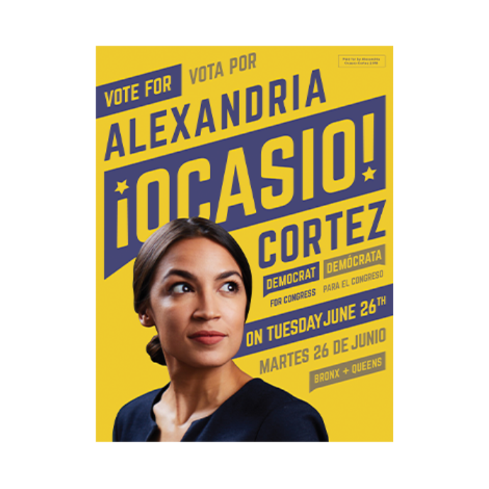 We’re now going to talk about an exclamation point that did work. In our humble opinion, Alexandria Ocasio-Cortez’s branding for her 2018 congressional run was the most important development in political design in a long, long time. At MissionWired, we knew the tide had shifted when, instead of receiving veiled requests to deliver the Obama logo, we were explicitly asked to create “something like AOC’s.”
Generally, if you’re branding a Democratic cause and want to use an arrow, you’re going to run into one major problem: If it’s a forward arrow, it’s going to the right; if you try to flip it to go to the left, you’re going backward. The team behind the logo – Tandem Design – solved the arrow problem by tilting the typography upward, creating the optimism and forward momentum that often elude political logos. The New York Times even wrote a piece about how this trend exploded in the next cycle. It’s also notable for using off-shades to create a warmer patriotic color palette, and it inventively incorporates Spanish to be a truly bilingual piece of campaign literature.
Rooted in historical protest signs (and even the Obama “HOPE” poster), AOC’s campaign art shows that there’s still room to create effective, innovative design in the political arena.
Where We Are Now: Innovative Designs From Recent Cycles
Post-2020 election cycle, political logo design is seeing a daring revolution. Candidates are ditching the traditional blueprint of red or blue and choosing palettes that appeal to a broader, more inclusive audience. Gone are the days of stars and stripes as many candidates are opting for logotypes rather than imagery-based lockups. In the current political landscape, being American goes deeper than a patriotic display of the American flag. Today’s candidates are showing that breaking outside the box and reaching toward the people is the key to our nation’s continued momentum.
All my favorite colors
Sen. Catherine Cortez Masto
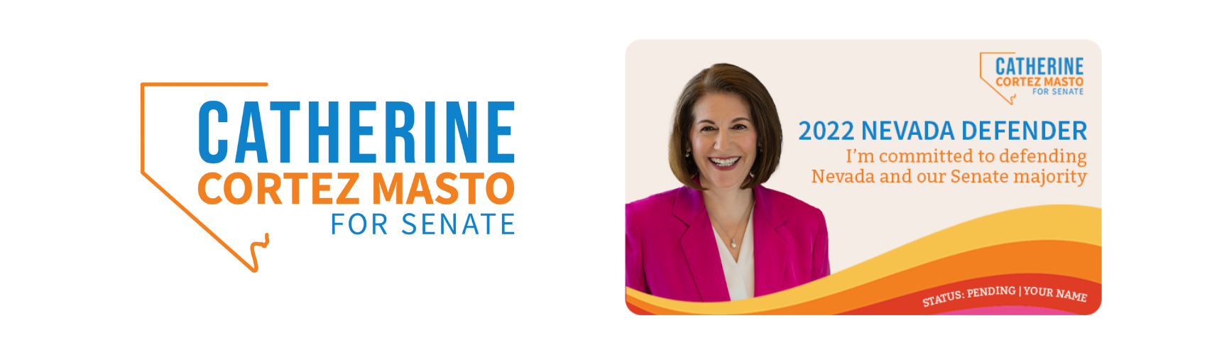
“I don’t forget where I come from.” Those are the words of Sen. Catherine Cortez Masto, and when looking at her 2022 reelection campaign branding, her roots shine brightly throughout each element. This rebrand is an intentional representation of Nevada’s colorful scenery, from the sandstone peaks of Red Rock Canyon to the dazzling lights of the Las Vegas Strip. Even more, the bright colors allude to her Latina roots just as her dedication to uplifting the Latino community did during her campaign.
Cortez Masto’s main logo colors feature mainstays from her 2016 Senate campaign: “Nevada Blue” and her namesake, a bright shade of orange, “Cortez Masto.” In 2022, the campaign expanded the palette to include six new colors – “Dark Sky,” “Desert Sun,’ “Power of Attorney,” “Cactus Fuchsia,” “Red Rock,” and “Sand,” helping her draw a bold contrast to her opponent’s logo. Where previous challenger Adam Laxalt emphasized various shades of red within his logo’s sun image, serving as a conservative aura radiating across the Silver State, Cortez Masto chose to expand her reach to include multiple dimensions of Nevada’s natural and social landscape.
But wait, the fun doesn’t stop there! Multicolor striations and wavy starburst patterns are utilized throughout marketing materials, bringing forth a sense of livelihood and encouraging action. These striations are a spirited nod to the Obama “O” logo, symbolizing hope and forward momentum in a climate where Latino sustenance is in jeopardy.
Classic Combinations
Sen. Raphael Warnock
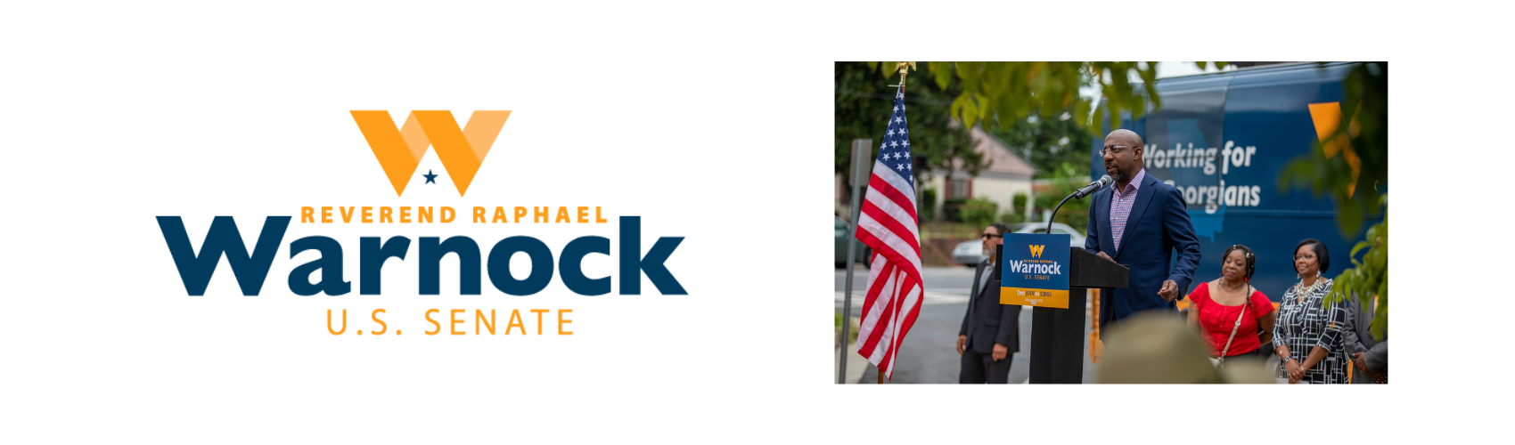
Make no mistake – Sen. Raphael Warnock is Georgia proud. That pride comes through with the campaign’s Georgia peach-inspired “W” mark, paired with a deep navy blue. This campaign is an organic example of speaking directly to your audience, emphasizing the ideals and symbols they hold near. For natives of the Peach State, this sweet fruit symbolizes not only a rich history but a deeply rooted dream of prosperity and positive change.
Orange and blue, existing complementary colors, serve as a tried-and-true dynamic duo throughout the campaign, bringing forth feelings of stability and trust. There’s something to be said about not reinventing the wheel, and this brand color system is an excellent example of taking an existing concept and running with it. For moments that need a softer touch, lighter blues can be emphasized and strategically paired with subtle deep tones. For moments that need amplification, the orange takes center stage.
A Personal Touch
Rep. Ayanna Pressley
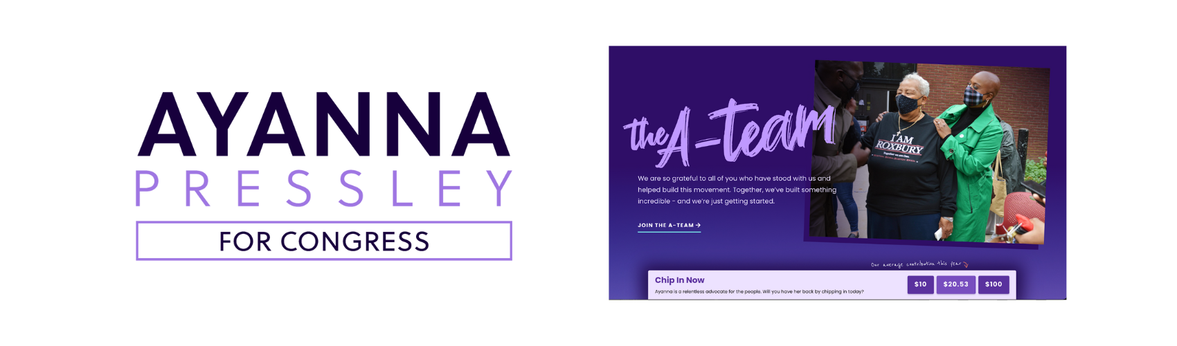
Congresswoman Ayanna Pressley’s campaign centers on bold, transformative change rooted in radical love. In today’s climate, bipartisanship can sometimes feel like a far-off dream, but Pressley is dreaming big and bold, centering purple, a revolutionary union of red and blue, as the main hue for her brand. Pops of lavender, orange, and blue can also be spotted as accents throughout the brand, offering a soft, warm touch and reminding us of her democratic ideals.
It’s clear in her messaging: “Change can’t wait – and neither will we.” Pressley’s brand offers a refreshing approach to political campaigns, utilizing script-style brush fonts for eye-catching headers and handwritten fonts and arrows as small accents. Organic elements provide a personal touch, helping supporters truly feel part of Pressley’s A-team.
Go Bold or Go Home
Sen. John Fetterman
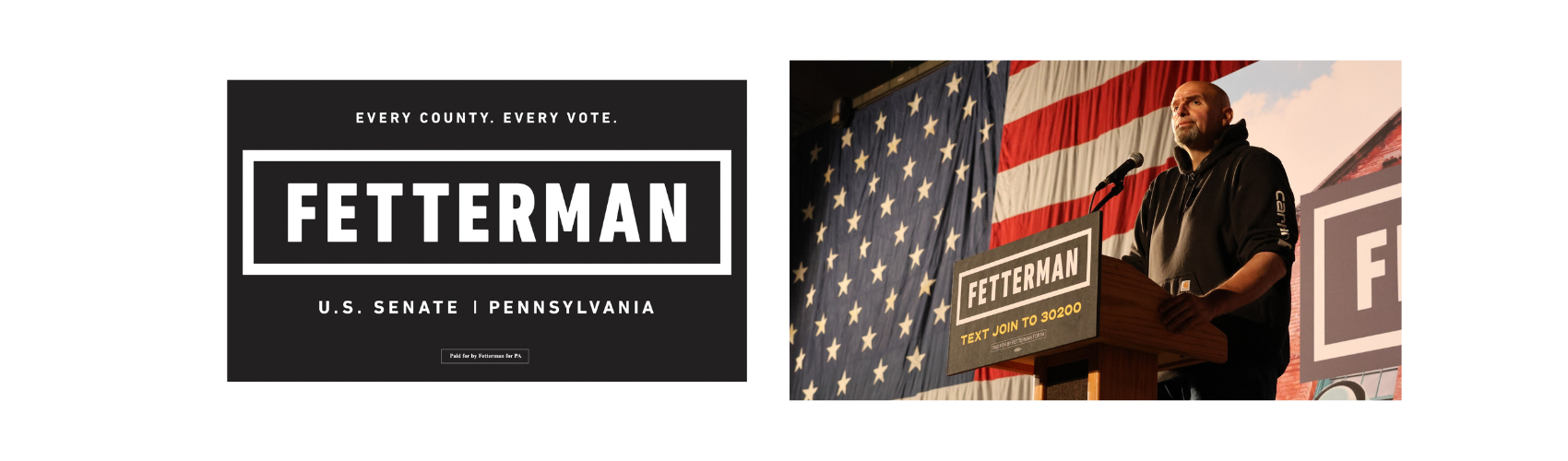
Sen. John Fetterman describes himself as a different kind of Democrat, and his branding is a clear reflection of that distinction. Instead of highlighting his name in a proud Democrat blue, he refrains from the typical use of American colors and symbols that most campaigns utilize. His approach? No frills. No nonsense. Straight to business. His logo features his slightly kerned name in a bold typeface, enclosed by a bold rectangle, almost appearing as a stamp. By choosing not to utilize any imagery outside of these elements, it reinforces his unapologetic approach to his role.
Simple and Direct
Run for Something
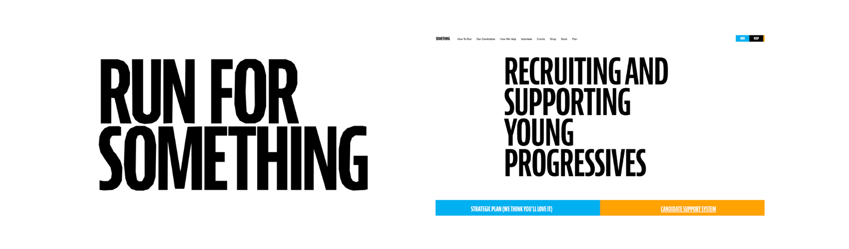
Progressive organization Run for Something emphasizes a to-the-point approach in its branding, opting for a Bernino Sans, a tall, bold typeface in its main logo, and nothing else. This no-frills take on branding mirrors its name, simply encouraging supporters to run for office. Nothing more, nothing less. Though we all are aware that running for state or local office is nothing to take lightly, this simple yet strategic approach is effective in minimizing the intimidation and imposter syndrome that can come with taking on a career in politics.
In the brand’s color palette, orange continues to be the perfect companion for blue, with black and white taking the forefront. Reinforcing the organization’s priority of relating to its audience at a human level, popular memes full of viral pop culture moments dominate their social media platforms, allowing supporters to easily and effortlessly engage, and maybe even be inspired to change the world.
![]()
Looking for more political inspiration? Check out this hub of logos past and present. Want to see the latest creative trends shaping nonprofit fundraising campaigns? Give Building Your 2025 Creative Toolkit a read.
And – subscribe to our newsletter, Recurring, to stay up to date on the latest fundraising trends and updates.
Next insight