Creative and brand strategy, Digital strategy
End-of-Year Fundraising Graphics: A Conversation with MissionWired Art Director Lauren Allen

Lauren Allen
Vice President, Art Director
The busiest weeks of the year for our nonprofit creative teams are upon us. Recently, just before that plunge into the year-end season, we had the opportunity to sit down with our art director, Lauren Allen, to ask her a few questions about the strategies and inspiration that drive her and the rest of her design team during the end-of-year rush. For tips, tricks, and collaboration advice, read on:
As we all know, year-end is a busy time for teams responsible for building fundraising campaign graphics. How do you approach collaboration as you design?
I always value the perspective of the people on our accounts team who keep a birds-eye view of each client’s calendar and work. They are great about clueing me in to what’s worked in the past, letting me know when we need to mix it up a bit, or reminding me of a tactic that was really successful in the past. I can take that and consider new ways to approach an entire project, or small changes that can make something like a donation button stand out in a new way.
Working with a large team of designers, do you ever get the chance to collaborate with colleagues working on other projects at MissionWired?
Yes! Before joining MissionWired full-time, I worked as a freelance designer for eight years. After working in a highly siloed way for that long, it’s very easy for me to appreciate the incredibly rich pool of talent at my fingertips here. Our design team has a Slack channel where we share pieces we’re proud of, or work through design challenges together. Sometimes it just takes a fresh set of eyes! It’s never a question of “is this possible?” because the answer is almost always “yes.” Between our team of writers, designers, and developers, we can make almost any creative idea come to life in a way that beautifully represents our clients and catches the attention of potential donors.
When you’re searching for a new approach in design, where do you find inspiration?
I am always looking at digital content through a lens that asks, “What inspiration can I pull from this?” or, “What is working here, and how can I apply it to my next project?” And that’s where collaboration comes back into play: working on a team with a variety of people, each with their own unique ways of experiencing the internet. If all of us are finding inspiration in our own inbox, and we combine the effects of all this inspiration, we can land in some really new and exciting places.
I also think it is important to look beyond the nonprofit and political space for inspiration. Our audience doesn’t view our work in isolation from the rest of the internet, so we need to consider the full scope of their experience and solve for that. How can we stand out in someone’s inbox?
Can you think of a time when design outside of the fundraising space has influenced one of your campaigns?
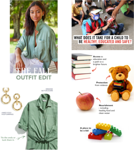
Absolutely. Recently, we came across an e-commerce email from Vineyard Vines that broke down a new fall look into parts. We liked how eye-catching the design was, so much so that we used it as inspiration for Save the Children for an email that asked the question: “What does it take for a child to be healthy, educated and safe?”
What other tactics do you use to make end-of-year graphics stand out in inboxes?
Right now we’re in a season when everyone is bombarded with emails, so just securing an open is a success. You want to engage them right from the start, and an attention-grabbing graphic at the top is one great way. Countdowns, photos, thermometers, and animated GIFs are more ways. And you always want to have a button! Think about how to make those buttons different, make them look like they can be pushed in, and think about where you can place that button in an email. And with everything you try, test, test, test, to keep yourself on the leading edge of what’s working.
What else do you think is essential to keep in mind when designing EOY graphics?
This time of year, when I create fundraising graphics, I’m thinking extra hard about both ends of the equation: Who is donating and how do I grab their attention – but also, who is the subject of the work, and how do I represent them in an equitable and human way through the graphics I create? It’s important to remember that the subject of our fundraising is a person, or a community, and we want to be engaging, but also respectful.
On that note, I think it’s so valuable to remember what a difference it makes when we care deeply about our clients’ missions. It’s easy to take for granted that I get to work for clients whose missions I believe in. Working hard during end-of-year rushes is easier when I remember the personal, invested interest I have in the outcome of these campaigns.
If you’d like to take a peek at how 2021’s Giving Tuesday results are shaping what’s to come at EOY, check out the first installment of our final report here. For guidance on streamlining your Quality Assurance in the busy season, read our recent blog, Six Tips for an Error-Free End-of-Year.
Next insight