Creative and brand strategy
Uncanny: The underdog design trend of 2025

Lauren Allen
Vice President, Art Director
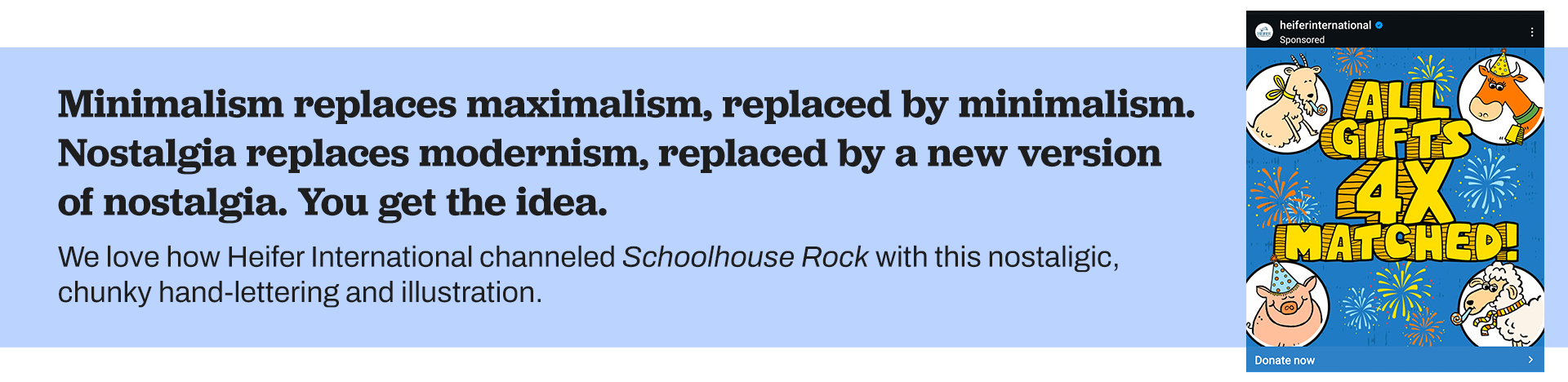
Design is both influenced and influencer. It is a representation of society in time and place. Trends cycle through as reactions to previous trends, technological advances, and major events. Minimalism replaces maximalism, replaced by minimalism. Nostalgia replaces modernism, replaced by a new version of nostalgia. You get the idea.
But recently, I’ve noticed something that feels more pervasive and harder to describe. It’s uncanny. It’s the AI-generated images with too many fingers. It’s the smoothed-over depiction of reality that feels anything but real. It’s the haunting aesthetic of the show “Severance.”
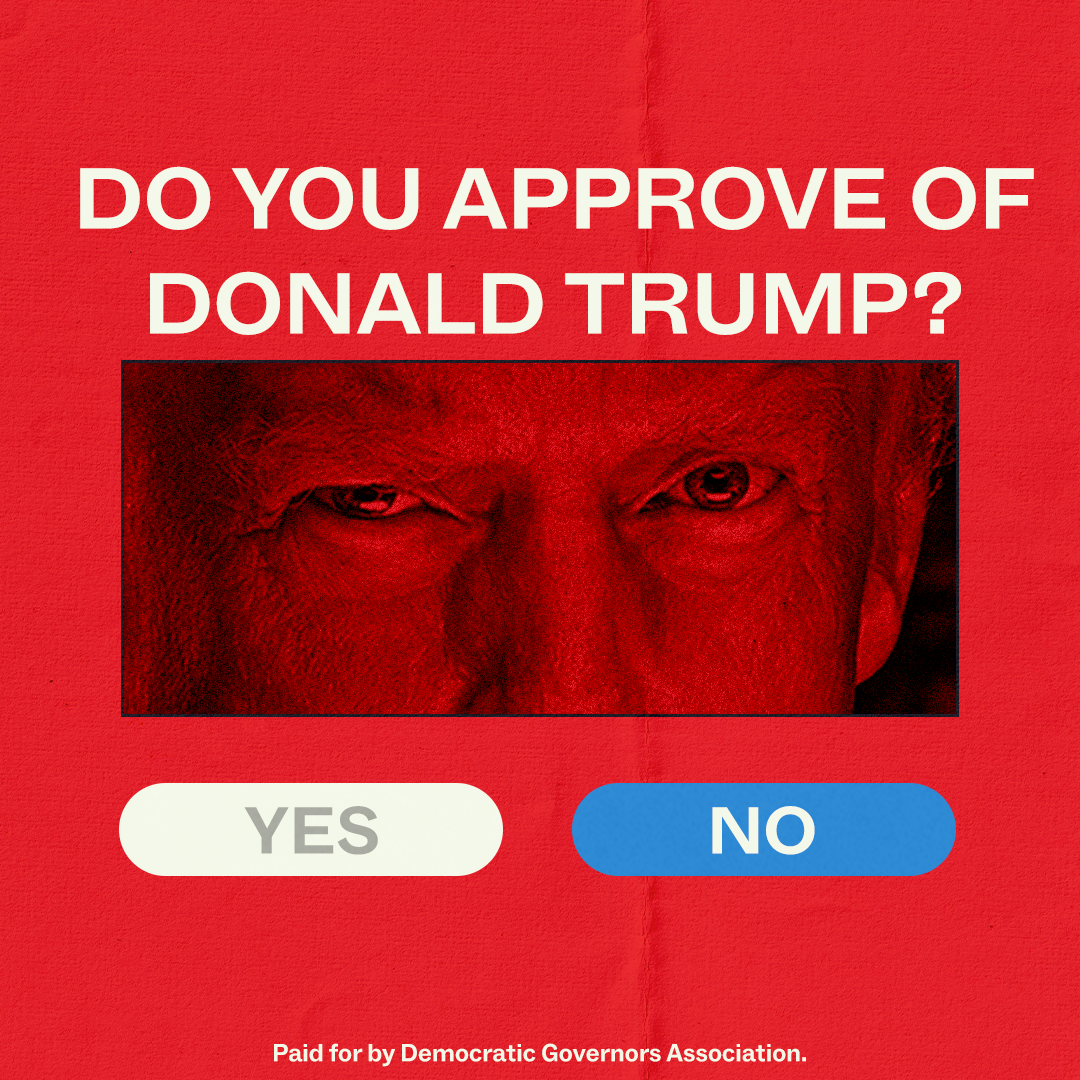
 This trend, if we can call it that, is a tension between ultra-clean, almost clinical aesthetics and the disturbing undertones of something deeply wrong. When design starts leaning into this uncanny feeling, where the aesthetics are both sterile and sinister, it evokes a kind of dystopian tension. We begin to question the relationship between technology, human experience, and reality itself.
AI, which generates visuals that look familiar but “off,” becomes a mirror for this very tension. As the lines between human-made and machine-generated blur, we feel both a sense of awe at the possibilities and unease at how detached from our own humanity these creations can seem.
Have we reached a new frontier in design? One where design is no longer only a reflection of society but also a product of automation and algorithms that can anticipate our desires? The uncanny emerges when we begin to realize that our choices are no longer purely ours to make.
Recently, our design team has been leaning into this uncanny aesthetic as a powerful way to create eye-catching, urgent, and timely visuals for the nonprofits and campaigns we partner with. We’ve found it’s a powerful way to illustrate the tensions that so many organizations are grappling with right now. Here are five techniques our design team has been experimenting with to channel some of these uncanny vibes for our partners:
![]()
Texture
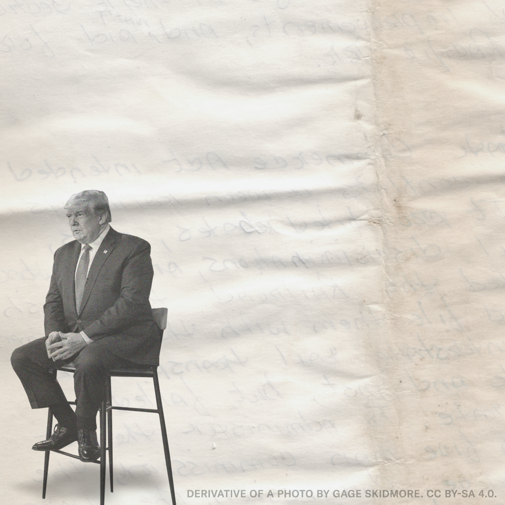
A subtle way to mix nostalgia with modernism, a la “Severance,” is by adding a film grain texture to an otherwise sterile and minimal composition. Check out this example for Sen. Jacky Rosen:
Scale
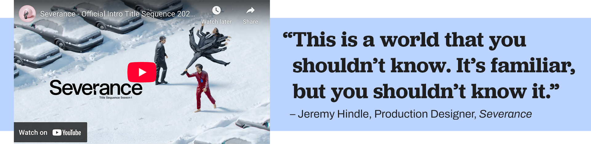
In Jeremy Hindle’s recent talk at Figma’s annual conference, Config, he describes the emotional impact of playing with scale. If you look at the show “Severance,” in the “outie world,” Mark is often shown very small in the frame, almost ant-like, in a cold and isolated world. By stark contrast, the “innie world” is nearly claustrophobic with low ceilings and tight elevators.
As designers, we can mimic these techniques with cropping and composition. Zoomed out, we reduce the emotional power of the subject. Zoomed in, we increase the sense of urgency.
Color
By using a limited color palette, individual colors take on more significance. A limited palette helps viewers focus on the details and story without distractions. The fewer competing colors there are, the stronger each remaining color becomes. In the real world, colors are rich and plentiful, but in an uncanny alternate reality, we’re creating a world that, as Hindle describes it, is “familiar, but you shouldn’t know it.”
Dimension
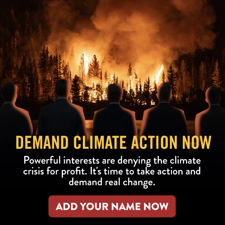
Playing kinetically and emotionally with 2D and 3D elements can build entire worlds that tell a story of looming consequences for our planet. Check out this example for Friends of the Earth:
In this example, we experiment with color, scale, and dimension to create an uncanny, bordering on unhinged, quote graphic featuring Lauren Boebert. 2D illustration mixes with overly saturated AI clouds sourced through stock imagery, an image of Lauren in a teal dress perfectly matches the teal in the background, and Musk and Trump are scaled down to become cartoon-like – think devil and an angel appearing over someone’s shoulders, only in this case, both have the wrong idea.

Subtle Movement
Finding the space between still image and video creates a visual tension that has users doing a double take. In this first example for Human Rights Watch, a simple text-only graphic is enhanced with a slow-scrolling textured background.


AI and Ethical Responsibility
We would be remiss if we didn’t bring up the environmental concerns of AI and the energy it requires. There’s much we still don’t know about the surge in electricity demand in data centers around the world. AI-generated trends like this “action figure” one have been seen all over social media. Artists and designers are fighting back with “no AI required” 100% human-powered art.
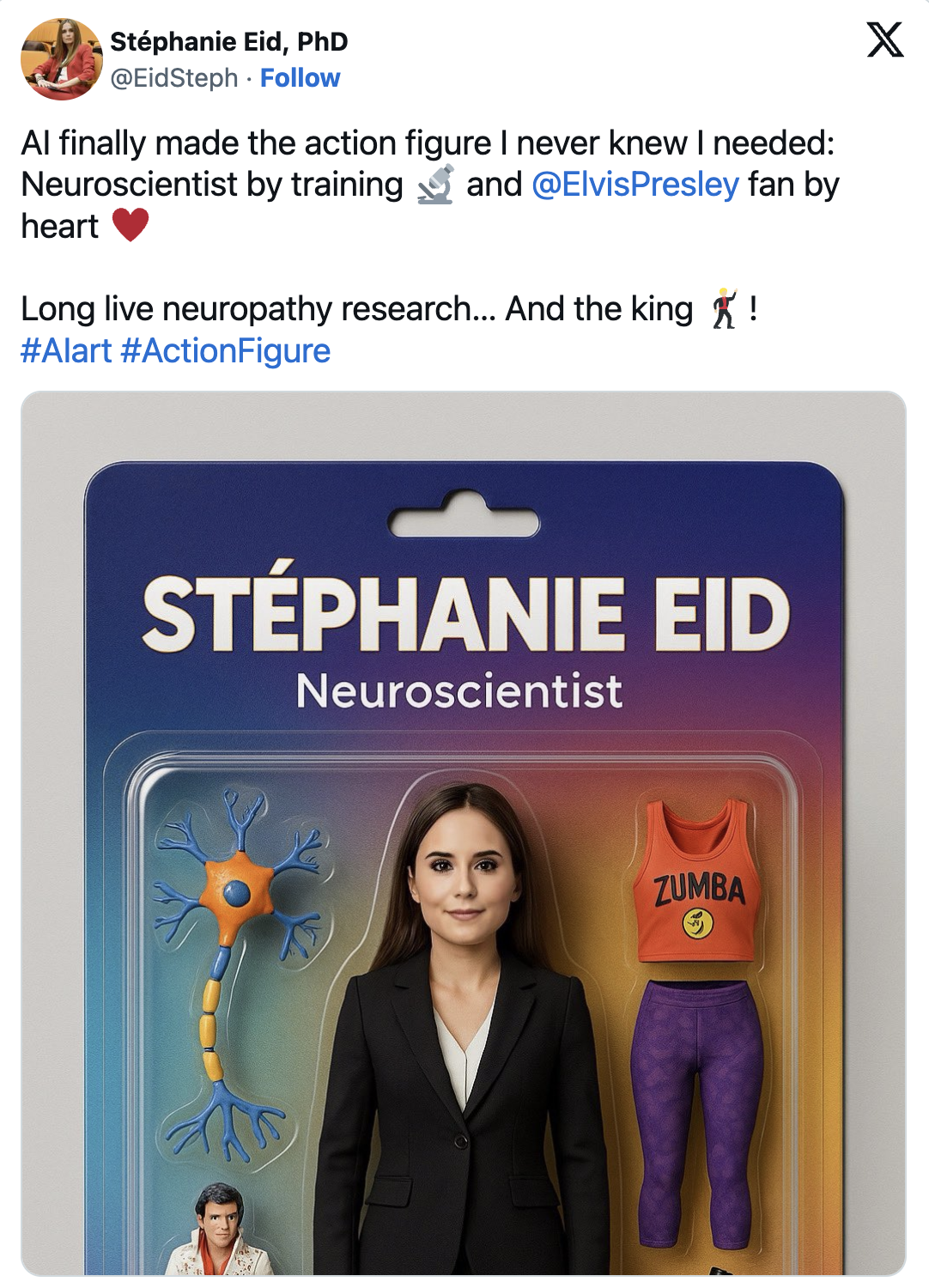
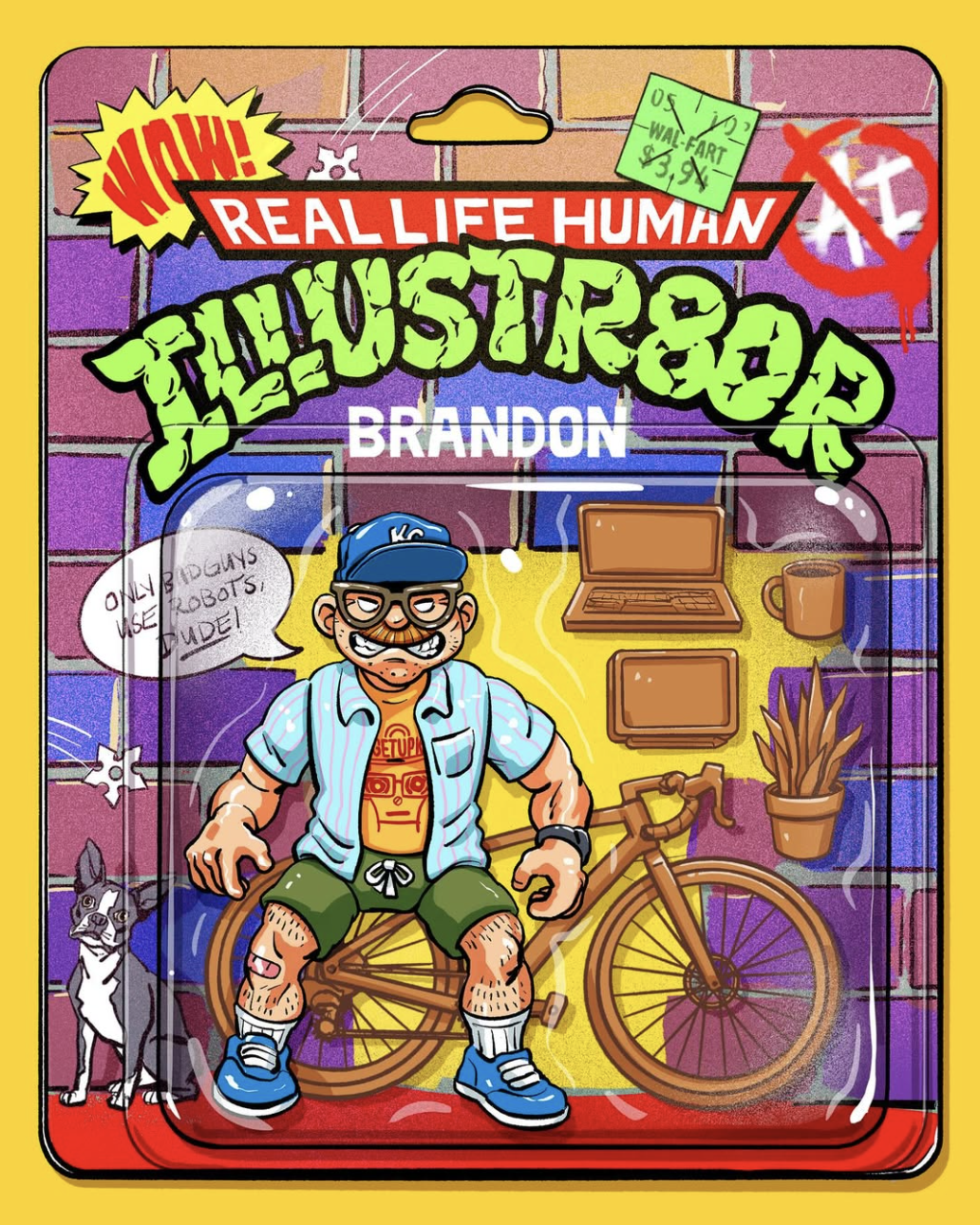
We’re inspired by these responses, and are careful to use AI sparingly and with scrutiny. With a mix of creativity and research, we’ve found that creating these uncanny compositions ourselves, without the use of AI, to be a worthwhile challenge.
So, as designers, what do we do with all this?
We take risks and break rules. Not in the Charlie XCX anti-design way or the hand-drawn tech rebellion way, but in a way that makes us feel uneasy. In a way that might upset your boss. Pair something you love with a pinch of something you hate. Mix nostalgia with modernism like “Severance.” Create a perfectly minimalist design and add something totally unnecessary and out of place. Take an iconic visual and distort it just enough not to get sued. Get weird, but not the normal kind of weird everyone has come to expect. Life doesn’t make a whole lot of sense right now, so let’s reflect that back in the designs we create.
![]()
Hungry for more creative insights?
Learn more about the design trends influencing graphics across the industry:
Next insight