Creative and brand strategy, Digital strategy, Email strategy
Dynamic, Memorable, and Incredibly Clickable: How GIFs and Movement Power Top-Performing Content
In key tentpole moments for your mission and at high-stakes times like Giving Tuesday and end of year, you’re dialing up every creative strength and leveraging every tactic to catch the eye of your supporters and inspire them to take action (right now!) in support of your world-changing mission.
That’s why every year, our End of Year and Giving Tuesday Reports feature the creative that’s catching eyes and driving clicks for the nonprofits that we partner with – because a memorable graphic, alongside a strong and well-planned message, can power the top-performing campaign that helps your program meet your goals and even break some fundraising records while you’re at it.
We sat down with our design team to talk about what’s exciting right now in the world of graphics, and the answer was resounding: Nonprofits are driving strong results by using GIFs and movement in graphics to create dynamic, memorable, and irresistibly clickable content within their campaigns – across email, ads, and SMS.
Subscribe to our Recurring newsletter for more updates on the latest nonprofit and political fundraising best practices and strategies:
1. Add movement to illustrations for eye-catching and action-inspiring visuals.
Incorporating more creatively styled visuals to your campaign allows your organization to create a unique and memorable brand that supporters will associate with your mission. By adding movement to those visuals, you have the opportunity to make your graphics all the more eye-catching and even enhance meaning to inspire action.
We’ve talked before about the value of eye-catching graphics in fundraising messages to draw in supporters and drive engagement – but what if you took that one step further and made those compelling graphics come to life in a GIF?

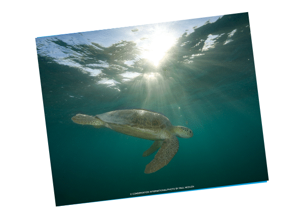
This graphic we developed with Conservation International for a January thank-you email sent to end-of-year donors did just that. Initially a stunning photo of a turtle in the ocean, movement was used to give the effect of a thank-you card opening. This invites you in with a classic nod toward email’s older cousin, direct mail – but then enhances it with the extra magic of digital, when the message inside the card has the power to move and offer up two more eye-catching graphics.
By choosing graphics that display the beauty of the oceans that Conservation International is working to protect, we’re using this engagement tactic to deepen supporters’ affinity for Conservation International’s critical and world-changing mission by reminding them of the impact of their work and what’s at stake in protecting these beautiful places and environments.
2. Get creative with tactical elements: Movement can make ask arrays and buttons all the more exciting.
A tried-and-true fundraising tactic for big moments, matches and multipliers have had a major impact on engagement rates and donation revenue for nonprofits during critical campaigns like end of year. Buttons, in and of themselves, are eye-catching and compel clicks – but why limit yourself to a static button when movement can make a donate button even more irresistible?


Preparing for the 2023 end-of-year giving season, we worked with Save the Children to make their donation buttons, which share a special 5X match opportunity, communicate impact in a dynamic, clickable way. With emphasis on the work being done to provide health, education, and protection to children, this new twist on ask array buttons slide to reveal graphics to further emphasize the impact of a donor’s matched gift.
Impact sharing within donation buttons is a fantastic way to give your audience a tangible sense for where their support can go. It’s a valuable opportunity to illustrate the work your program is doing toward its world-changing mission.
3. Use videos – along with illustrations and colorful accents – to make longer-form content more digestible to your audience.
Movement can also play a significant role in a campaign that’s aiming to communicate more information. The ability to break up text into smaller pieces on the screen while highlighting key points for emphasis can help your audience track and follow your more complex messaging.
We worked with Teacher2Teacher to build this video sharing teaching tips with their audience of educators and found that movement made a big difference in sharing advice in an engaging and easily digestible way. We’ve found that hand-drawn illustrations have been a fantastic way to accent T2T’s brand and communicate their mission. And the ability to make the teaching metaphor come to life in this video, with a hand literally throwing spaghetti at the wall at the end, was a fun and engaging way to communicate with this audience.
![]()
Want to learn more about how MissionWired approaches the development of dynamic fundraising graphics? Check out our Conversation with MissionWired Art Director Lauren Allen. For more examples of top-performing creative content, read Scroll-Stopping Appeals: Four Creative Trends in Giving Tuesday Emails. And to learn how our design team prioritizes accessibility when designing graphics, head to Shortening the Distance: Trends in Design & Accessibility from the MissionWired Graphics Team.
Next insight