Creative and brand strategy
What Can We Learn From Successful EOY Creative?
During the end-of-year season, as nonprofits jockey to stand out in crowded inboxes, it takes creative thinking and out-of-the-box ideas to accomplish an organization’s goals. So what can we learn from the top performers of 2020 and bring into our 2021 campaigns?
We have answers (and hopefully a little inspiration).
Save the Children
One of the biggest parts of Save the Children’s work is responding in moments of emergency, and these moments are when we see some of the strongest fundraising and engagement from their email list, too.
It was clear the audience was interested in this work but how much did they really know about Save the Children’s emergency efforts around the world?
We put together a timeline that supporters could click through to learn how Save the Children’s teams respond when disaster strikes:

Another way we helped Save the Children stand out is through emails that leaned on visually impactful graphics rather than lots of text:
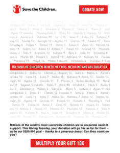
In both cases, these emails don’t just look pretty – they work. Even though it didn’t include an up-front ask to give, the emergency timeline still performed as well as many fundraising emails. And the graphic-driven email was Save the Children’s second best performing email on Giving Tuesday. Not too shabby!
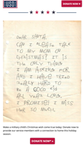
USO
The theme of successful graphic-driven emails continues into our work with the USO.
Providing our troops with connections to their loved ones back home is one of the main goals of the USO’s work. To convey just how meaningful it is for our troops to get something as seemingly simple as a phone call, we drafted an email from the perspective of a service member’s child:
Next, we took a bit of a different approach to an email asking the audience to vote for their favorite USO holiday card. With four designs to choose from, our four in-house designers each developed a different design – putting their own spin on the card. We were so impressed by the results, and we think you will be, too:
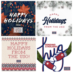
By breaking up text with big, compelling graphics – or leaning mostly on graphics altogether – the USO was able to stand out in crowded inboxes and far surpass their end-of-year goals.
Friends of the Earth
The key to Friends of the Earth’s success? You guessed it: graphics. Take a look at this highly designed email that drove incredible fundraising results:
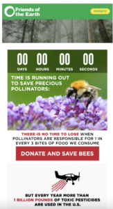
The graphic-driven style of email stood out from the typical messages Friends of the Earth sends throughout the year. This was a new approach for them, and it ended up being one of the top performing messages during the final end-of-year push.
Sandy Hook Promise
Alright, we thought we’d close this out with something a little different: versioning that iterates on the tried-and-true supporter record tactic. Here’s how this came to life for Sandy Hook Promise:
Subject Line: Re: your last donation in April 2019
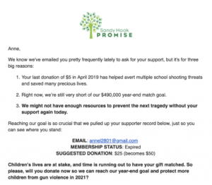
Both the subject line and the sentence in reason #1 pull in data on the supporter’s latest gift. For those who haven’t yet made a donation, their subject line was versioned as “Re: your donation status” and the sentence in the email itself read “We know you care deeply about gun violence.”
Combined with the supporter record, this kind of versioning made this email feel personal to each member of the list, driving incredibly strong results during a high-stakes moment like end-of-year.
Next insight