Creative and brand strategy
How Our Favorite Creative Stood Out in Q1
The first quarter of a new year affords a world of opportunities to think outside the box, get creative and try new things. This is especially true this year, as the coronavirus pandemic finally comes under control and audience attention creeps back offline. How can your organization stand out in inboxes? The answer may be in these examples.
Here are some of our favorite pieces of creative from Q1 of 2021 – the content that inspired, surprised and motivated us – and the lessons we’re taking away from them:
Bringing The Fire: GirlTrek
Ah, the perennial challenge: Putting the “new” in “newsletter.” When it comes to tried-and-true formats, the trick is to balance what’s proven to work with something new, eye-catching and interesting to elevate the concept. For GirlTrek’s Friday Fire newsletter, we did that by leading with visuals – creating bold graphics, playing with fonts and leveraging powerful photography to keep the audience engaged.
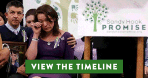
How a Promise Evolves: Sandy Hook Promise
Some of the families who lost loved ones in the Sandy Hook Elementary shooting have spent the past eight years working to pass lifesaving gun violence prevention legislation. Their passion and commitment is deeply moving – but it’s also difficult to capture all at once. As Congress debated a new background checks bill, we worked with them to turn the timeline of their work into an interactive user journey highlighting their tireless work to pass background checks just months after their loved ones were murdered and in the years since. Supporters can click through the timeline to see photos and videos of key moments – and then take action to help expand background checks on gun sales.
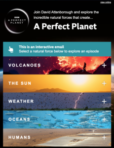
Perfect Planet, Cooler Code: BBC
This email from the BBC stopped us in our tracks. Remember our original question of how to keep audience attention online and in inboxes? The BBC cracked that code with this interactive message, building an accordion menu into the email itself. Now, every inch of the visual space showing at any time is exactly what the recipient wants to see, and their curiosity will likely take them through the whole email, whereas laying everything out at once might have overwhelmed them.
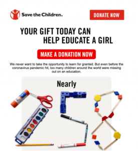
One for the Visual Learners: Save the Children
Part of the work of digital communications is distilling big ideas into small, punchy packages. Few ideas are bigger than the value of educating a child – and few pieces of creative strive to encapsulate that concept as comprehensively as the graphics we developed with Save the Children. For their campaign around educating young girls, we created images that brought together common visual cues for education, all the tools a donation might bring to a student’s disposal, and used them to literally spell out the impact a donor could have.
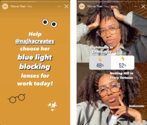
Direct to Consumer: EyeBuyDirect
One more from the “outside world” that’s inspiring us: EyeBuyDirect is among the retailers using Instagram’s voting feature to show off the range of products it offers and engage customers’ personal investment and preferences. This poll got us thinking: How might nonprofits use this feature? The simplest application might be asking supporters to vote on designs for a free sticker or other premium. But we also considered that this method could be used to show a variety of tangible impacts of a donation: Would your supporters rather fund Outcome A or Outcome B? Will they swipe up to donate toward that goal?
Next insight